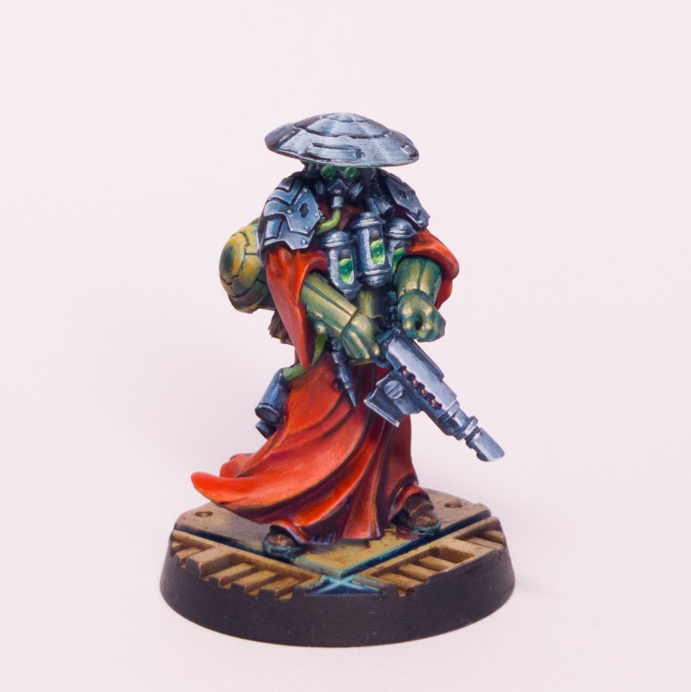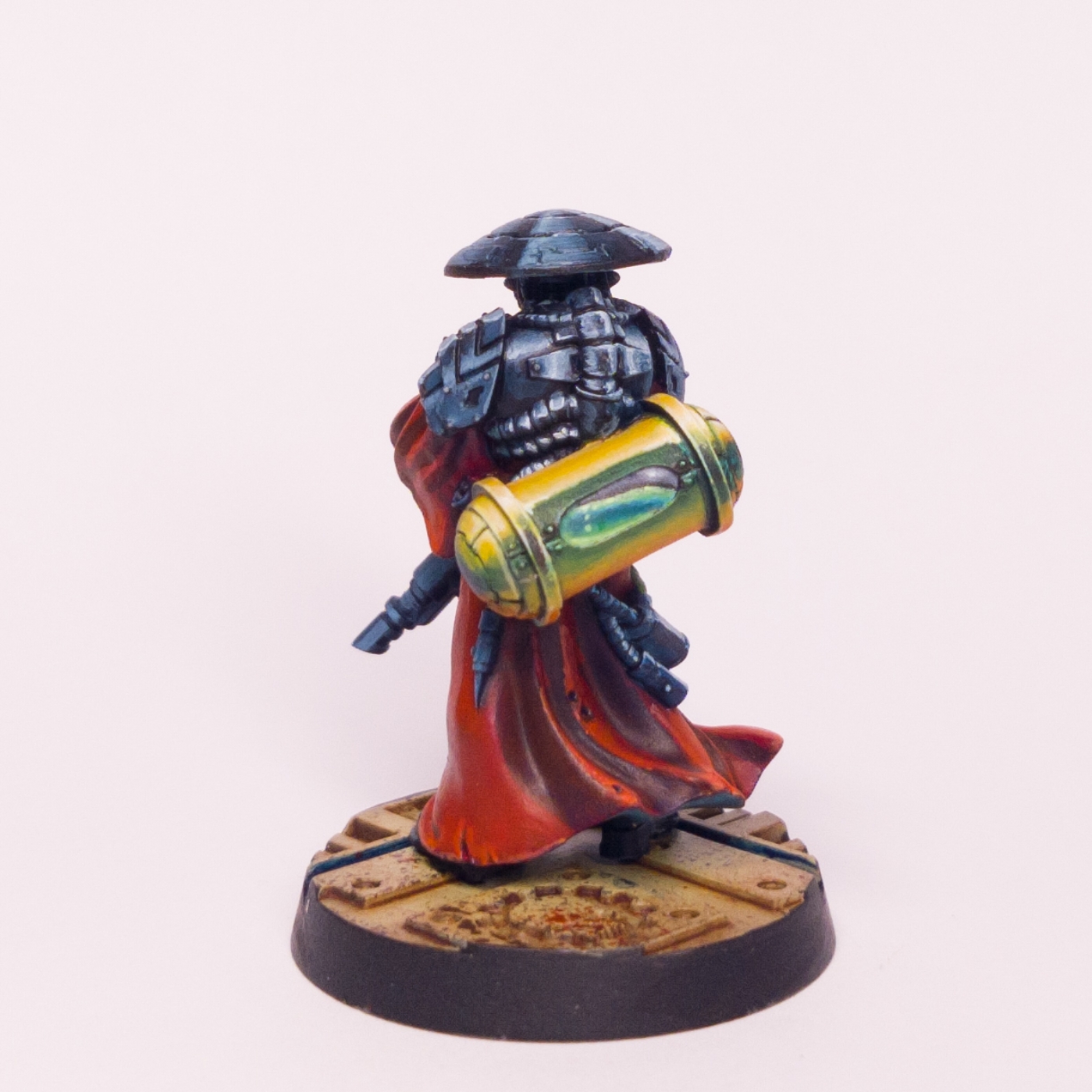
One of the Inquisitor's retinue. Was really happy with how shiny the metallics were, and the liquids. Less happy with reds, but hey - learning and time I can fix that next year ...
Painting the canister so brightly was fun, but in hindsight it dominates the other colours and shouldn't be a focal point - the liquid should be where the eye is drawn to on the rear, not the overall object.
The gloves are my quiet success on this project. I worked hard to create a smooth effect with a lot of glazing, based on the style of Albert Moreto Font (https://www.instagram.com/albert.moreto.font/) and would like to try more of this, as it wasn't as terrifying or long to do as I thought it would be.

No comments:
Post a Comment