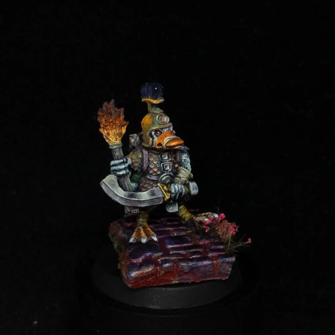
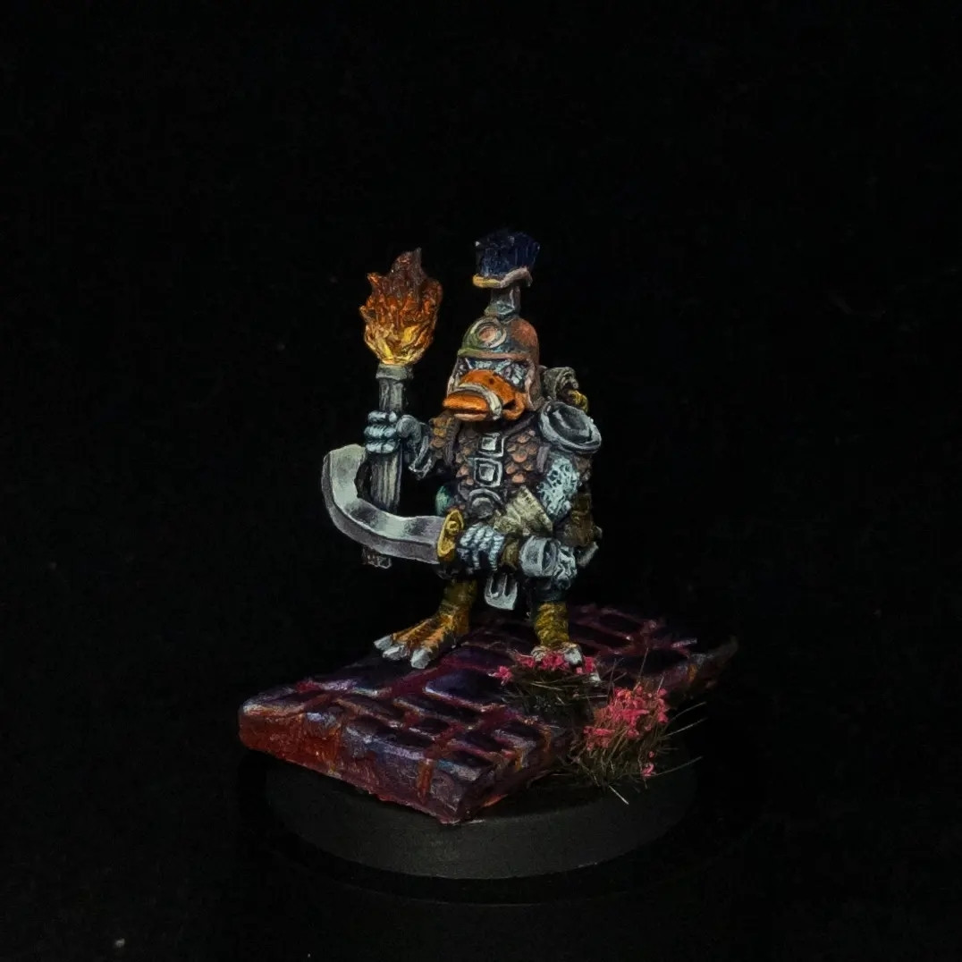
Showing posts with label fenris. Show all posts

Wednesday, 23 July 2025

Bugbear Chieftain

It's another one from Fenris (https://fenrisgames.com/shop) and yet another Kev Adams sculpt. Really, really happy with how the copper NMM turned out, and his club. The face is decent too, and overall it's a decent piece. My photography continues to let the side down, but that's fine.

I will never be a fan of sculpted fur. I get the reason for it; basecoat, drybrush, wash and win, but when you want to paint it with a bit more detail, it's a real pain in the bum.


At the end of a project I often (most of the time) forget to take a picture of my palette as a guide for what colours I used. There's a good amount of mixing as the project develops,


Sunday, 20 July 2025

Army of Duckness

I don't get to paint many models for companies. I'd like to do it more often. These were for the wonderful Ian at Fenris Games (https://fenrisgames.com/shop) for his Army of Duckness range, and I was pleased with the result.

It's such a characterful group and glad I had the opportunity to paint them and do something a little different from what other people had done. The sculpts are fantastic but a touch frustrating in a couple of places where a detail feels unfinished. Not a major problem, but the rest of the sculpt is so good, you feel the pain of small irritants more. If you see Fenris at a model show, you may see them in a display cabinet too!

But honestly, you can't beat a nice selection of D&D ducks, can you?

Trying to determine which elements should be the standout is tricky in a group setting, but the beaks and weaponry felt like the natural choices. The feet and basing don't need much attention. Chief Duck was a touch harder as it has so many fantastic elements that I wanted all of it to be the focal point! In the end I opted for the beak, speartip and helmet.


Wednesday, 29 July 2020

The Cauldron Warband


Fenris Games make some lovely, crunchy, oldschool sculpts. Their last Kickstarter (https://www.kickstarter.com/projects/thecauldronwarband/fenris-games-the-cauldron-warband/description) was a fine example of this. Really digging that Realm of Chaos, late 80s vibe and was compelled to back it.

I wanted to inject a little more colour and less uniformity, as it's often my downfall when painting.

Definitely quick rather than precise, but it was fun trying to mix all the colours from just magenta, blue, yellow and white. Happy with the result, which is colourful, yet miserable.


Hinrich Rottgard
Mixed feelings on this fellow. I didn't enjoy painting the robes on the rear, and feel it shows that I rushed it.


Kopron the Razor
The metals were painted as a greyscale, then I introduced all the colours from elsewhere on the model to liven them up.


Putriss Aranica
Trying to paint a bright rust was good fun. Some texture added into the robes just to break up the surfaces. Face detail is almost irrelevant under the big old pointy hat.


Maldred Plaguebringer
The first one painted, and colour-wise definitel the most linear on transitions.


Annuvin The Watcher
My favourite sculpt and paint job. The bird as a bluish light source, contrasts with the yellow lights on the opposite side, and then some gentle glow on the face added because I could.


Sunday, 5 May 2019

Ruined Church

Phew.

This has been a while in the making, and I'm happy it's done - but have no idea how best to photograph it, so here we go.


The idea itself should be fairly evident. It's a priest standing in the ruins of his church, defending the remnants from dark devils, with the righteous power of light spilling out from his holy symbol. There's living flowers in the back of the shot, and everything in front of the church is being consumed by the darkness.


A few accessories in the side to give a lived in/refuge feel to what remains of the church. These are from various suppliers, possibly Tabletop World, Ristul's Marketplace or one of the small vendors at Salute. I sort of threw things together that felt like the right dimensions.

It should be the last bastion of whatever remains in the area. Giving the feeling that that this a partial view of a greater whole. More church out of the scene, more devil dogs being summoned from hell too.


The sly devil dog creeping from the side, but still partially caught by the light was good fun to position.


Big thing for me here is that there's no pure black anywhere on the piece, nor pure white. They weren't even on the palette at any point. The closest I got was dark brown washes on the barrels, and a very saturated dark blue for the shadow. Brightest is ivory on toenails and teeth, and Ice Yellow on the final light highlights.

I tried to convey a very bright, white light for his power, and a warmer, menacing light from hell for the devil dogs. Here's an overhead shot to demonstrate it a little better.


There's a little bend on the lower devil dog light source, but I realised my error too late - and stuck with it.  This does show the difference between the purity of light source from the church, versus the glow in the background suggesting worse things to follow.

Overall, I learned quite a bit about how to build a diorama and also what not to do the next time. Getting too excited and gluing the pieces into final position is NOT RECOMMENDED and will make your life significantly more difficult, so that's definitely a tip I'd pass on right now.

Saturday, 9 February 2019

Ruined Church diorama: WIP #3

And so it continues.

I had a crisis moment after the last update and added more shadows into the recesses, but lost the yellow altogether. I also remembered that shadows don't need to be nearly black, they just need high contrast between the colours. So back we went, with a lot of yellow and a lot of ... bright blue? But it's worked ...


The tiles around the light were too dark, and the blue helps to sell the image of a magical light beaming out. The colour contrast is very pleasing.

Alright, so the shape of the light is off a little when looking at it from overhead, but sssh! If you don't tell then I won't. It should give away where one of the protagonists in the scene will be standing too ...


Even up close this feels much better, and the specular highlights help to sell the effect. Crisis of confidence averted, and we're getting closer to completing this now!

Wednesday, 9 January 2019

Ruined Church diorama: WIP #2

A little more paint added to this one now. Starting to plot out where the light whille come from and go to. Initially this doesn't make any sense when viewed in isolation.


Then you see where the figures will be positioned and how the story comes together. I love these hell dog sculpts from Heresy Miniatures. Painted one when they were first released, and very happy to be painting a couple more after so long.


Finally from the reverse position and some of the lighting and shadows in place to explain what I'm trying to achieve.


Now the lights are in place, I need to work out how best to darken the scene further. Thin glazes of deep brown and purple worked well in the taller corner already as my test, which bodes well for the future.

Saturday, 1 December 2018

Ruined Church diorama: WIP #1

I don't usually make dioramas, as I'm seriously lacking in the imagination and creativity required. Thought it was time to make an attempt at one, to see if it was viable. In my head, I have a small scene with a priest holding the doorway of his ruined church against hellbeasts. Simple but a nice enough scene.

This is a combination of blue foam, part of a Rubble City set from Fenis Games (https://fenrisgames.com/shop), and Super Sculpey patterned with a roller from Green Stuff World (http://www.greenstuffworld.com/en/). Highly recommend both companies, and Fenris are awesome.


I've never used foam or Super Sculpey before, so this is new territory. Happily, my first attempt didn't suck, so it went straight onto the board! Putting hobby projects in the oven for ten minutes on a medium heat is something of a novelty ...

The tiles in the blue foam are one inch square and created by running a toothpick in straight(ish) lines to make it look like large flagstones.


Priming everything makes such a difference in bringing the scene together. No longer are you looking at multiple textures and materials, but the picture starts to emerge.


Next step is starting to define the differences in colour between the inside of the church, the walls, and the courtyard outside. A lot more colour variety is required, but this is a good start and I'm feeling positive about the direction it's going.